Redesigning Archetyped: Building Mockups
Sketches standing by? Check.
Photoshop prepped? Check and double check.
(You did download the free mockup toolkit, right?)
All systems are go– let’s make some mockups for your website!
Pick a layout, any layout
A website is made up of a few basic layouts. Generally, a website will need a distinct layout for the home page, archives, and single posts/pages.
We’ll call these cornerstone layouts— your site may require other layouts, but they will generally be riffs off of the cornerstone layouts.
Even then, there are elements of a page that are common to all layouts, such as the header, footer, and perhaps a sidebar.

Diagram of common layout elements
This is why it doesn’t really matter which layout you start with when designing mockups. It may be worthwhile to select a layout that has a high number of common elements, but if you have a clear idea for a specific layout, then start with that one.
Don’t waste time thinking about which layout to start with because you’ll ultimately be creating a mockup for each cornerstone layout anyway.
If you really get stuck on where to start, choose one at random from your stack of sketches. That’s what they’re there for.
For this tutorial, we’re going to start with the single post layout. It’s a fairly straightforward layout that shares the header and footer with the rest of the site.
Broad Strokes
Just as with sketching, don’t focus too much on the details when you begin designing mockups for a website. You can fill in the details later. In the beginning, focus on things like structure and spacing to make sure that the layout works for its intended content.
Add just enough detail to determine the design works or not.
Where should the page’s title go? Should the logo be in the center or to the left? Where is the best place for the site’s navigation menu? How much spacing is needed for the article’s text to be easy to read?
These are the things you should be experimenting with as you start building mockups for your site. Each mockup should be a new crack at finding an even better answer to these questions.
The design may not be terribly exciting at this point, but the goal is to find a viable layout as quickly as possible.
No amount of detail will fix a layout that’s broken from the start.

Simple mockup for a single post layout
Iterate, don’t overwrite
This is really important.
If you’re working on a mockup and the design is not working, don’t worry about it. Just duplicate the layer group (Ctrl-J/Cmd-J) and take things in a different direction.

Duplicate layer group for new design
Sometimes you may feel like starting a new mockup completely from scratch. There’s no problem with that, though there are likely elements in your current layout that are worth keeping. Duplicating the layer group allows you to reuse the good parts of the layout and discard the rest, saving you time and effort.
Protip: Removing the “copy” text on all duplicated layers gets old really fast. Open the layer panel’s options and disable the Add “copy” to copied layers and groups option (Photoshop CS5+).

Turn off copy text for duplicated layers
The important thing to remember is that you should never throw away a rejected design. There’s a lot of experimentation involved when building mockups and you will have designs that you’re not thrilled with. Instead of deleting your work, create a new layer group and click the eyeball next to the old one hide it. Now it’s out of sight but you still have a history of your progress, which is useful for several reasons.
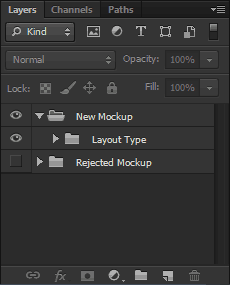
Hide rejected designs, don’t discard them
Reuse & Recycle
For example, it’s not uncommon to find that an element from an old rejected design works perfectly for a new one. It may have seemed out of place in the rejected mockup, but it fits right in with the new one. This just means that the better design was trying to get through even when you were working on that old terrible one.
You’re Not Thinking Clearly
It’s the end of a long day of designing mockups and you can’t decide whether Emerald or Nephritis works better. In fact, as far as you’re concerned, the whole design doesn’t work. You resist the urge to trash the design completely and close up shop for the day, feeling like you wasted an entire day on bad design.
But the next day, after a good night’s rest, you open Photoshop half-cringing at what you’ll see. To your surprise, you find that your designs are not half as bad as you thought they were yesterday. Yesterday you were tired and not thinking clearly, but now you see that these designs definitely have potential.
Now you’re glad you didn’t give in and delete yesterday’s mockups. If you had, you never would have been able to get a second look with clearer eyes, and all your work would have been lost.
Move 2 Steps Forward
Also, retaining old designs keeps you from going in circles. When you start on a new design, you can review your previous mockups to see what didn’t work so that you don’t waste time doing the same things. This way, you’ll always be moving forward.
It’s Fun
Finally, it’s just fun to look back on your old designs and see where you started and where you ended up.
Branching Out
When you’re happy with a design, it’s time to start building mockups for the other cornerstone layouts. A design needs to work for the entire site, not just a single page.
Duplicate the layer group of the layout you’ve been working on and rename it for the new layout.
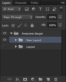
Duplicate layer group for new layout
A Bumpy Ride
You may hit a few snags along the way when the design doesn’t work perfectly for another layout. This is a good thing.
You don’t want to force every layouts to fit into a rigid set of constraints. Instead, the overall design should be updated across all layouts to tie them together.
Remember, you’re designing a web site, not a collection of disparate pages.
Sure, it may sometimes be necessary to deviate from the “global” design if a specific layout warrants it, so don’t hesitate to do so if it feels right. Ultimately you want each layout to have enough common elements to tie the site together. As long as you have this, don’t worry about slight variances between layouts.
Digging into the Details
Once you have a design that you’re happy with and a mockup for each of your cornerstone layouts, you are ready to start adding detail.
It is the details that will take your design to the next level and turn a mockup into a final polished design for your website.
We’ll be discussing adding details next time, so for now, keep working on those mockups. Experiment with wild abandon and remember to have fun!
Follow the Redesign: New Episodes Every Friday
Archetyped is being redesigned, starting from square one. Instead of designing and building the site in stealth mode and releasing it to much fanfare, I’m sharing the entire process with you as a series of tutorials that you can use to design your own site!
Along with workflows, tricks, and techniques, I’ll also be sharing custom tools and templates that I’ve developed over the years to help me build awesome sites better and faster.
I’d also love to hear your questions as well as your own experiences with designing a website, so post a comment and share your thoughts!
- Next up: Expect Delays (Building Mockups: Round 2)
- Start from the beginning: Redesigning Archetyped