Redesigning Archetyped: Sketching
We’ve tackled the theory behind redesigning a website by defining the site’s purpose, establishing a foundation, and looking at how the site will evolve to meet our new goals. Now it’s time to put that planning into practice as we move into the visual phase of the redesign.
Start with a sketch
By this time in a design project, I usually have ideas swirling around in my head, and I find sketching to be a great way to get those ideas out so that you can look at them more objectively.
Sketching is absolutely the fastest way to start laying out design ideas. Photoshop and HTML are great and definitely have their place in the design process, but they don’t hold a candle to the raw speed of sketching.
You can use any medium that you are most comfortable with when sketching. I prefer pen and paper over stylus and touchscreen because tablets lack tactility and still have too much lag, so I grabbed my trusty quadrille notepad and started sketching.
Pro tip: If you’re at all detail-oriented like me, graph paper is a life saver for sketching. Using the grid as a guide, you can keep your lines relatively straight without wasting precious time with rulers.
Your sanity will thank you.
The Tao of Sketching
Sketching is visual brainstorming, so the goal here is to keep details to a minimum.
The key to sketching is to be broad and fast. Sometimes those ideas that have been percolating in your daydreams seem great, but it’s not until you get them out on paper that you can truly see whether they work or not.
Pro tip: A thick-tipped marker like a Sharpie is perfect for sketching because it makes adding fine details nearly impossible, allowing you to focus on the bigger picture.
Just make sure you put something between pages so that the marker doesn’t bleed through.
Your sketches don’t have to look great. In fact, they shouldn’t— it just needs to be good enough to let you see whether the idea works or not.
Iterate
Design is a very iterative process and that holds true for sketching as well. Once you get an idea sketched out on paper, evaluate what works and what doesn’t. Then move on to the next sketch that builds upon the good aspects and resolves the issues with your previous one.
Sometimes though, you’ll need to start over completely. That’s fine. Everything is very flexible when sketching. Don’t get too caught up in the process. Just go where your ideas take you.
Wireframes: Tried & True
Wireframes are a great way to sketch out your ideas because you have a set of standard elements at your disposal for building layouts. Using these elements keeps things simple while you focus on spacing and the relationships of the various parts of a page.
Establishing a good rhythm for your design before you start focusing on colors and fonts and other details is very important. This is what wireframes are perfect for.
There are whole libraries of wireframe elements out there, but all you really need are boxes and some squiggly lines. Here are some standard elements to get you started with wireframes:
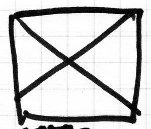
Image
Images are denoted by a box with an “X” drawn through it. You can use this for featured images, thumbnails, and even the site’s logo.
Heading
Headings are denoted by a bit of large text. Don’t worry about using different text for different headings. Using the same text for all headings while sketching is fine.
Text Block
Blocks of text are denoted by a series of horizontal lines. Make them squiggly or make them straight– it’s up to you. This element can be used to represent things like an article’s content or an image’s caption. The lines gives you a good idea how much space you’ll need to allot for text on the page.
In Practice
Here are a few example wireframes of various layouts for Archetyped’s redesign:
Thumbnails: Birds Eye View
Another useful approach for sketching layouts is using thumbnails. Like wireframes, thumbnail sketches help to spare the details while you focus on establishing a good rhythm for a page’s layout.
Size Matters
Thumbnails use many of the same elements as wireframes such as images and text blocks for building page layouts. The key difference is that thumbnails are much smaller.
Instead of using an entire page for a wireframe, a thumbnail will be less than 5cm wide.
This allows a lot more layout sketches to fit on a single page, giving you a birds-eye view of the different layouts. This perspective is useful for making comparisons between layouts as well as seeing the flow of an entire page’s content at a glance.
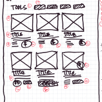
At this size, some elements in thumbnails differ from those in full-size wireframes. For example, a heading will be a filled in rectangle instead of legible text. Also, while a fat marker is good for full-size wireframes, a fine tipped pen is more appropriate for thumbnail sketches so that you can fit all of the elements of a page in such a small space.
In Practice
Here are a few example thumbnails of various layouts for Archetyped’s redesign:
How to tell when you’re done sketching
How do you know when you’ve sketched enough? This really depends on the scope of your project and how many layouts you need to design. You could spend half an hour or half a day on sketches.
However, the idea is to sketch only as much as you need to have a workable idea so that you can move on to the next stage in the design. Once you have something that works, stop sketching.
Do you sketch?
Sketching is an incredibly valuable part of the design process that I rarely eschew. By establishing a good rhythm for you page layouts, sketching can save you a lot of time and headache at later stages of the project.
What about you? Do you sketch? If not, will you add sketching to your next project? Let us know in the comments.
Follow the Redesign: New Episodes Every Friday
I’m opening up my design process and sharing everything as I post updates every Friday on Archetyped’s redesign. I’d also love to hear about your own questions and experiences with redesigning your own site, so leave a comment and link below!
- Next up: Diving into the details with Mockups
- Start from the beginning: Redesigning Archetyped


