Redesigning Archetyped: Make a Lasting First Impression (with Design)
Last time we discussed how having and expressing a unique voice is necessary to making an impact on a visitor and giving them a reason to return.
Here’s the problem: You may not even get the chance to make an impact with your content if your website’s design is turning visitors away.
First Impressions
First impressions are critical. It’s important to realize that your website makes it’s first impression before a visitor even reads a single line of text.
Your website’s design makes the first impression.
The site’s design is the first thing a visitor sees. If the design does not match the tone of the content, then visitor’s may lose interest before the page even finishes loading.
After the last tutorial you now know what you want to say, why you want to say it, and what makes it different than everyone else. You have a unique voice– you have a personality.
Today you will learn how to express your personality through your website’s design so that you can make a great first impression.
Step 1: Keywords
Create a list of keywords that reflect your personality.
Design doesn’t have the time to be wordy– it needs to be concise in order to communicate an idea at a glance. This list will help you boil down your primary message into something that can be expressed visually.
Example
Pulling from the examples in the last tutorial, here are some keywords that express primary message of the site:
- Simple
- Focused
- Creative
More Examples
Need more? Here are some additional examples of keywords that communicate various ideas:
- Tradition: refined, classical, stable
- Progressive: edgy, chaotic, changing
- New: light, bright, wide
- Potential: dreamy, open
- Playful: flowing, free-form
As you can see, you don’t need a long list– 2-3 keywords is enough as long as they are clear and concise.
Step 2: Make it Visual
Identify design elements that connect with your keywords.
Design is a means of communicating an idea– it is a language. Like all languages, design has a vocabulary.
When you’re talking to someone, you wouldn’t expect them to understand you if you used words they didn’t already know, right? Likewise, you should use design elements that are commonly understood to communicate your site’s message.
Pop Quiz, Hotshot
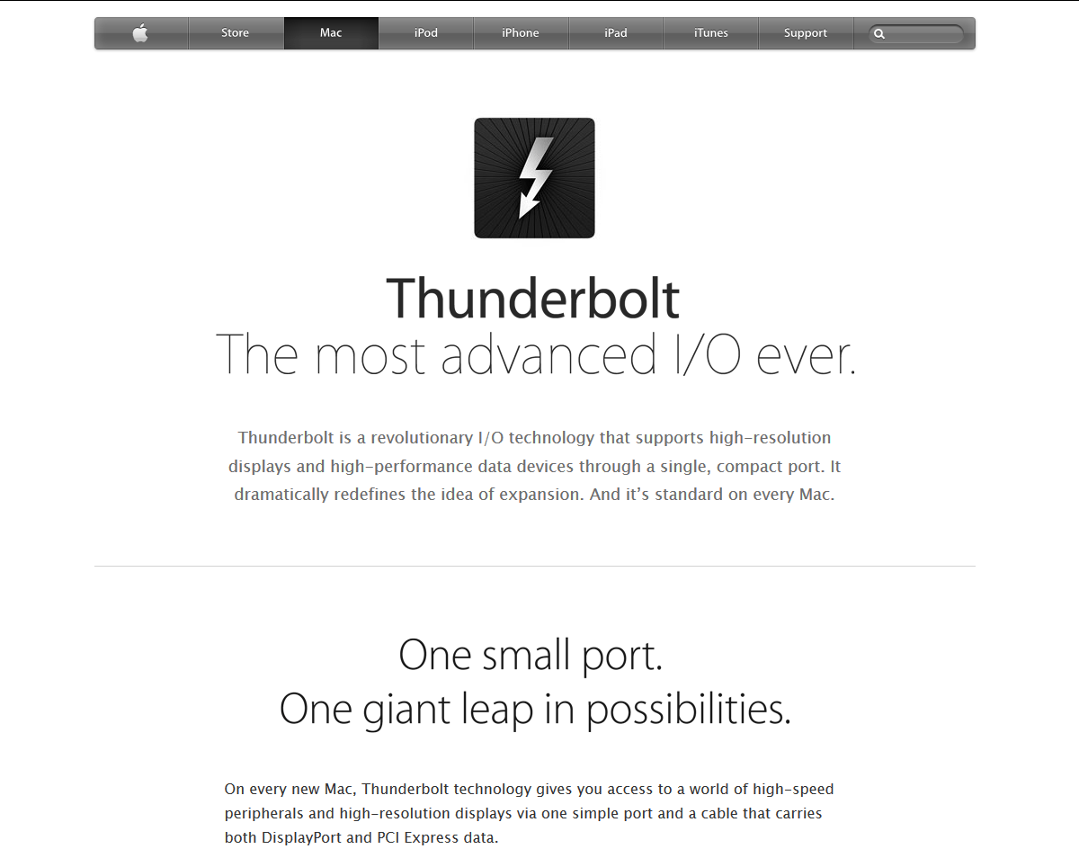
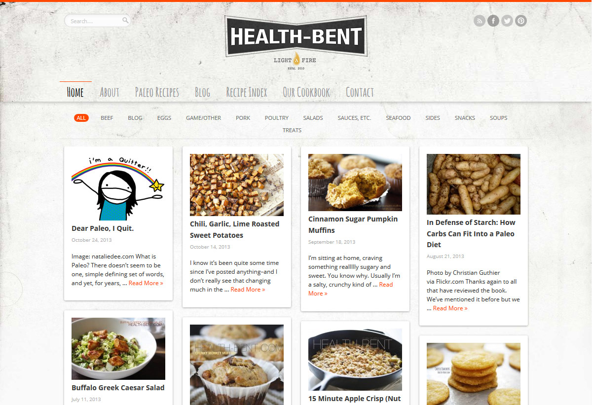
Looking only at the design, choose 3 keywords to describe each site. Pay particular attention to the fonts, colors, and the use of white space on each site.
Once you’ve chosen your keywords, look at each site’s content. Does the content match the keywords you’ve selected?
Movember

Apple Thunderbolt
Health Bent
Step 3: Make it Yours
Add unique touches to differentiate your design from that of other websites.
You’ve used common design elements to communicate your site’s message at a glance. Now add some unique touches to let visitors know that your site is different and special.
This can be as simple as a picture of yourself, a custom logo, or even a unconventional color palette. This is where you make your mark, so it’s completely up to you.
Examples
Here are a few examples of personal touches on websites:
31 Three
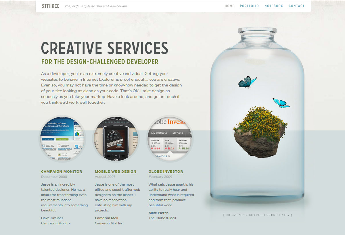
Though the layout and examples of client work are fairly standard for portfolio websites, the glass jar with blue butterflies and a floating rock gives visitors something unique to remember the site by.
Nom Nom Paleo
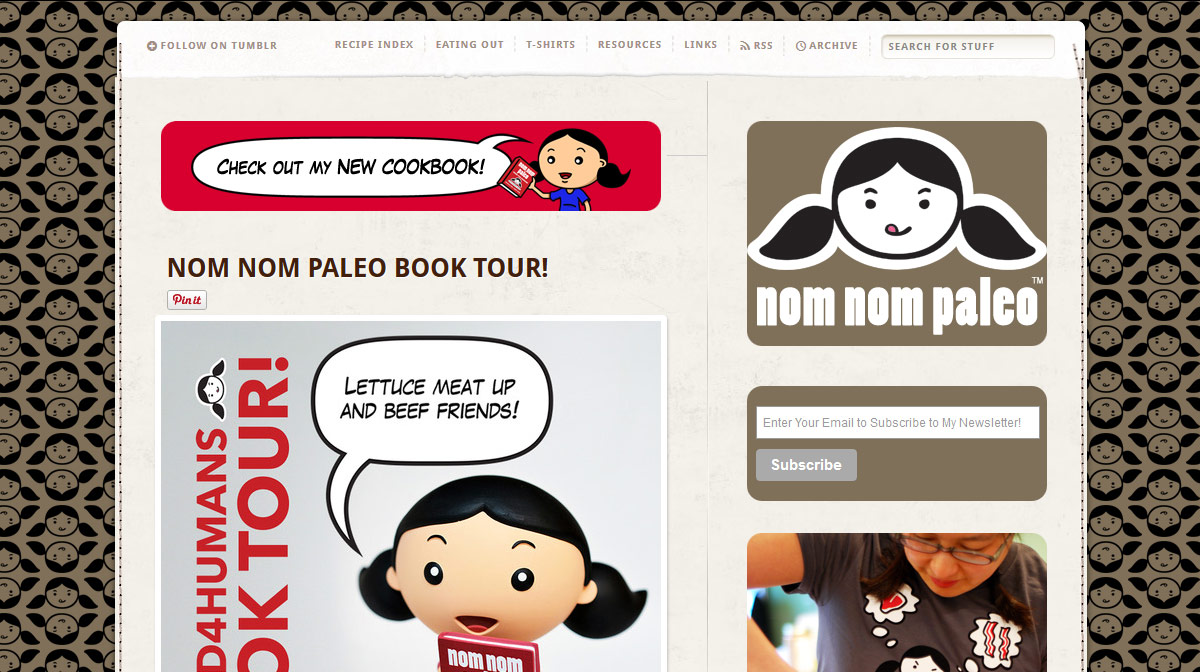
By all accounts, this is a standard Tumblr blog. However, the logo on the right both depicts the blog’s author and gives you an insight into her personality.
Looking at that logo will tell you whether you connect with the author or not in an instant.
Johnny Wander
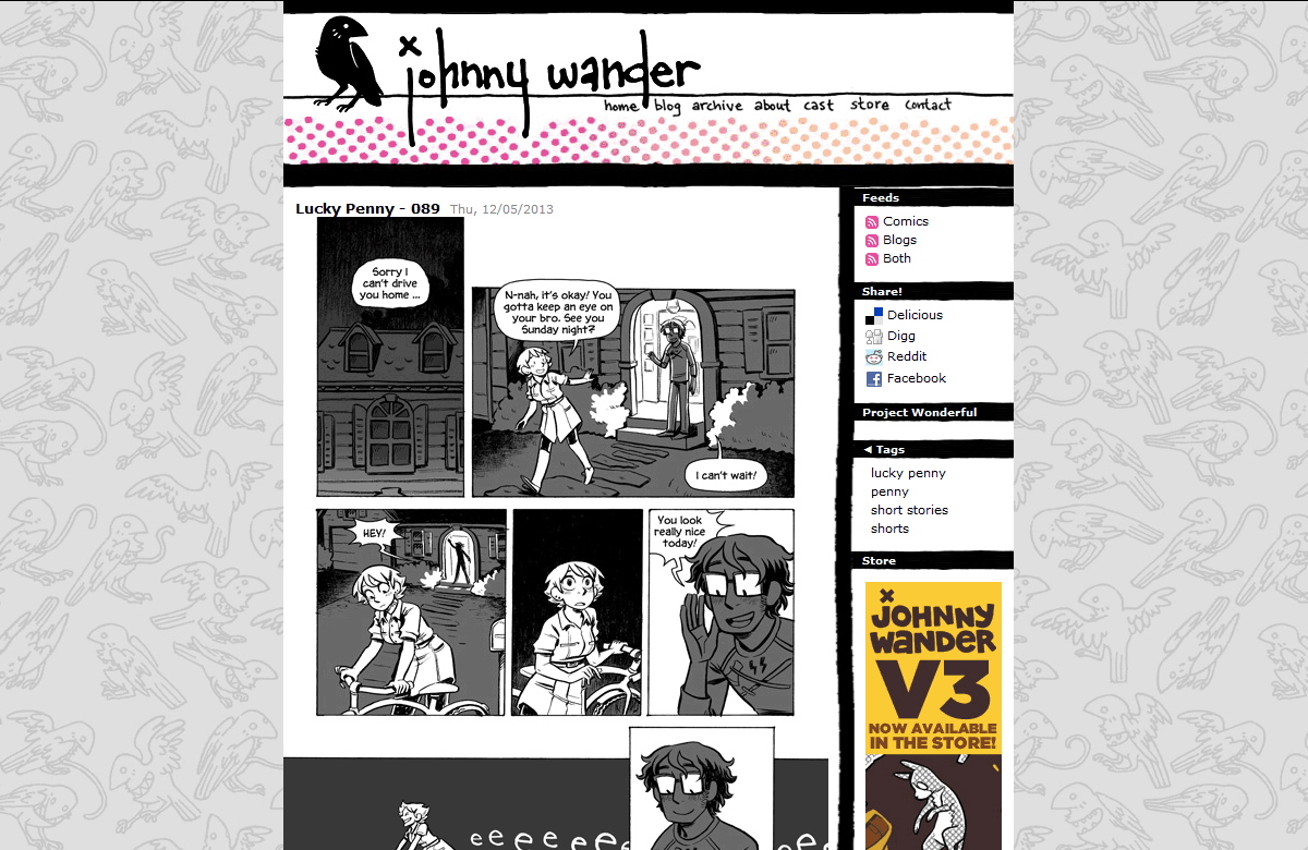
We can see at a glance that it’s a web-comic. But the hand-drawn elements such as the crow and title text in the header, as well as the strange Maws in the background give you a sense of the artist’s style before you see a single comic.
Bonus: Keep it Brief
Don’t spend too much time trying to make the design “perfect”.
It’s easy to fall down the rabbit hole of design as you attempt to imagine new and interesting ways to make your design unique. Trust me, I know.
As important as design is, it’s purpose on a website is primarily to make a good first impression and then get out of the way to let your content shine.
Therefore, don’t spend too much time fiddling with the design. This process should be simple using the steps in this tutorial. Get it done and move on.
Follow the Redesign: New Episodes Every Friday
Archetyped is being redesigned, starting from square one. Instead of designing and building the site in stealth mode and releasing it to much fanfare, I’m sharing the entire process with you as a series of tutorials that you can use to design your own site!
Along with workflows, tricks, and techniques, I’ll also be sharing custom tools and templates that I’ve developed over the years to help me build awesome sites better and faster.
I’d also love to hear your questions as well as your own experiences with designing a website, so post a comment and share your thoughts!
- Next up: From Design to HTML.
- Start from the beginning: Redesigning Archetyped