Redesigning Archetyped: Side Project
Sometimes it is good to switch gears and work on something else for a bit to get some much-needed perspective.
Case in point: I’ve been so deep in Archetyped’s redesign that things were starting to blend together.
I was losing focus.
So I put this site’s redesign on pause and started working on something that would let me look at this project with fresh eyes.
That’s right another redesign.
The difference was that the scope of this side project was much smaller and more straightforward. Really, it was more of a refresh than a full redesign. At least that was the idea…
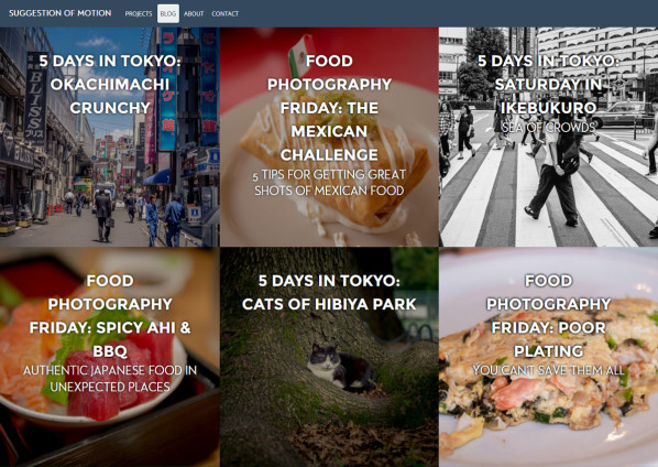
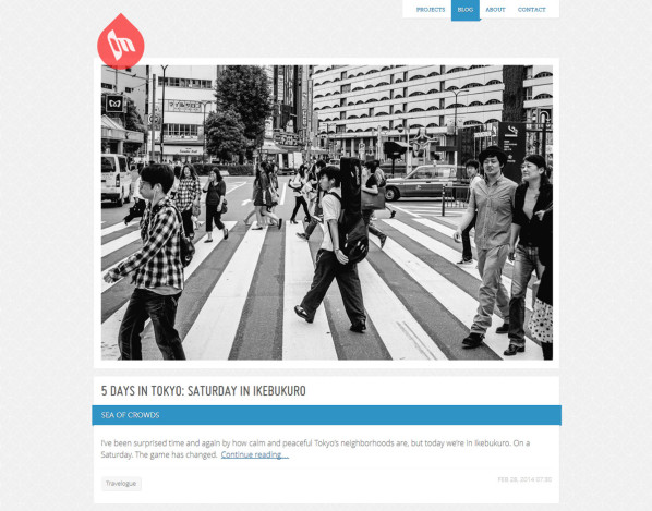
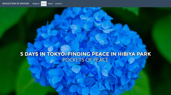
In the end, a 2-day project turned into a 5-day project, but the result is a fairly dramatic visual transformation that I’m very happy to have out in the wild: Suggestion of Motion
Having an updated site is nice, but the benefits didn’t stop there. In fact, the side-project’s biggest benefit was its impact on Archetyped’s redesign.
A Prototype for Archetyped
Suggestion of Motion’s previous design was not nearly as old as Archetyped’s, having been most recently redesigned in 2012. That said, it was in need of some sprucing up to accommodate the evolving direction of the site.
However, Suggestion of Motion’s focus on photos and videos is completely different from Archetyped’s focus on code and web design– how does this side project give me any perspective on Archetyped’s redesign?
While not everything in Suggestion of Motion’s redesign will transfer over to Archetyped, it does share several features planned for this site.
Using Suggestion of Motion’s new design, here is a preview of some of the things you can expect to see in Archetyped’s upcoming redesign:
Focus on Content
Sidebars have been banished on Suggestion of Motion.
Unless the goal of a page is to send users away to another page, sidebars have no place on a website. Sidebars only serve to distract visitors from the primary content on a page. Sidebars contain secondary content, but it’s placed side-by-side with the primary content!
Wonder why your bounce rate is so high? It’s because you’re sending visitors away with a more interesting link in the sidebar!
That’s not to say that secondary content has no place on a page, just that it should take a secondary position. In most cases, this means that content usually found in the sidebar will show up below the primary content.
Likewise, post metadata will be…somewhere. Details like publication date and tags do have value, but just like on Suggestion of Motion, these things will be absent in the initial release of Archetyped’s redesign.
While useful, metadata is simply not important enough to delay release. This is one of the things I had to get perspective on by switching to a side project– I was digging deeper and deeper into the minutiae of Archetyped’s redesign. If I kept going, who knows when the redesign would ship?
More Visual
Suggestion of Motion is focused on stories told through photography and video, so a highly visual design makes sense.
While it might not be evident at first glance, an emphasis on visuals also makes sense for Archetyped’s more technical slant.
Visuals help to set the tone of the content regardless of the context. Though code may make frequent appearances, you are still telling a story. Visuals can help tell that story more effectively by setting the stage for the mindset a reader should have.
As a result, visuals will play a larger role in Archetyped’s upcoming design.
No Comments
Suggestion of Motion has no comments and soon, neither will Archetyped.
Encouraging healthy discussion is very important– it builds a sense of community and helps good ideas grow into great ones.
I’ve enjoyed the discussion we’ve had on this site, but I’m just not so sure that standard WordPress comments are the best way to facilitate discussion.
Discussions on this site’s content are already being held all over the web, so I prefer to let that continue as organically as possible. Attempting to box the discussion in to a single website limits the reach an idea can have.
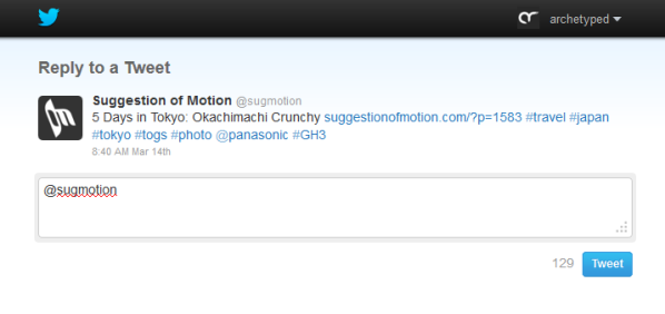
In the future, I may look into tools like Disqus to aggregate discussions from across the web to help users more easily join in the conversation after reading a post. For the moment though, I’m using Twitter’s web intents to make it simple for visitors to share their thoughts on a post.
Step Out of the Shadows
Looking at Suggestion of Motion and Archetyped side by side, you can clearly see a stark difference.
Suggestion of Motion has always been light and bright, while Archetyped has been dark and stark.
Archetyped is coming into the light. It is no longer my “underground lab” and the redesign reflects that. A brighter appearance is more inviting, while improved white space gives users room to breath and improves readability.
Responsive
A responsive design is far overdue. Using Suggestion of Motion as the model, I was able to suss out the ideal breakpoints to provide the best experience for various devices and screen sizes.
Archetyped’s content will soon look great on any device as well.
Coming Soon to a Screen Near You
By focusing on a side-project with a smaller scope, I was able to get perspective on the big picture. Content and audience differ, but the structure and standards developed for Suggestion of Motion are just as useful on more involved sites like Archetyped.
Though there was some time lost on Archetyped’s redesign, it was completely worth the wait as this structure is useful for Archetyped and for future projects as well.
The next step is merging the new structure into Archetyped’s redesign. From there I can make adjustments to better fit this site and get an initial release out the door!
Related
- Suggestion of Motion — My photography and filmmaking-focused site.
- Twitter Web Intents — Make sharing content easier with customized Twitter links.
- Disqus — A socially-aware commenting plugin for websites.
- Redesigning Archetyped: Overview — Read about this site’s redesign from the beginning.
