Has WordPress Lost its Magic?
WordPress is everywhere. It’s the de facto blog platform the world over, and with developer-friendly features in later updates, WordPress has become a heavyweight among content management systems (CMS) as well. Today, you can practically use WordPress for anything.
However, as WordPress has grown more capable with each new update, has it also lost what made it so popular in the first place– its personality?
Write
It’s 2004 and I’m scrambling to find a tool to help me maintain a blog as I prepare to move to France. My requirements are simple: self-hosted, open-source, and easy to use.
Blogger is simple and popular, but it’s not self-hosted (nor open-source). Drupal is self-hosted, open-source, and if its impregnable administration menus are any indication, it is incredibly powerful. They say Drupal has blogging powers, but I just can’t find them.
All I want is to write a post about my first real French croissant and have it show up on my site for my friends (mom) to read. Why is it so difficult to find a tool to do something so simple?
Discovery
With my departure date fast approaching, I discover WordPress version 1.2, a small bit of open-source software that is quite a departure from the likes of Drupal. Instead of burying content creation functionality in a sea of ever-unfolding menus, WordPress puts it front and center– the very first screen upon logging in simply says, “Write”.
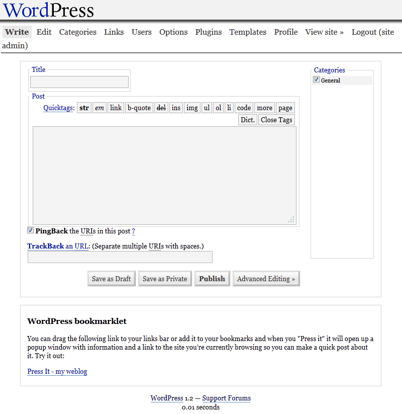
WordPress 1.2 Write Page
I obey, write my first post, hit publish, et voilà the world (i.e. my mom) can read all about the best croissant I’ve ever had in my life.
WordPress it is.
Rewind
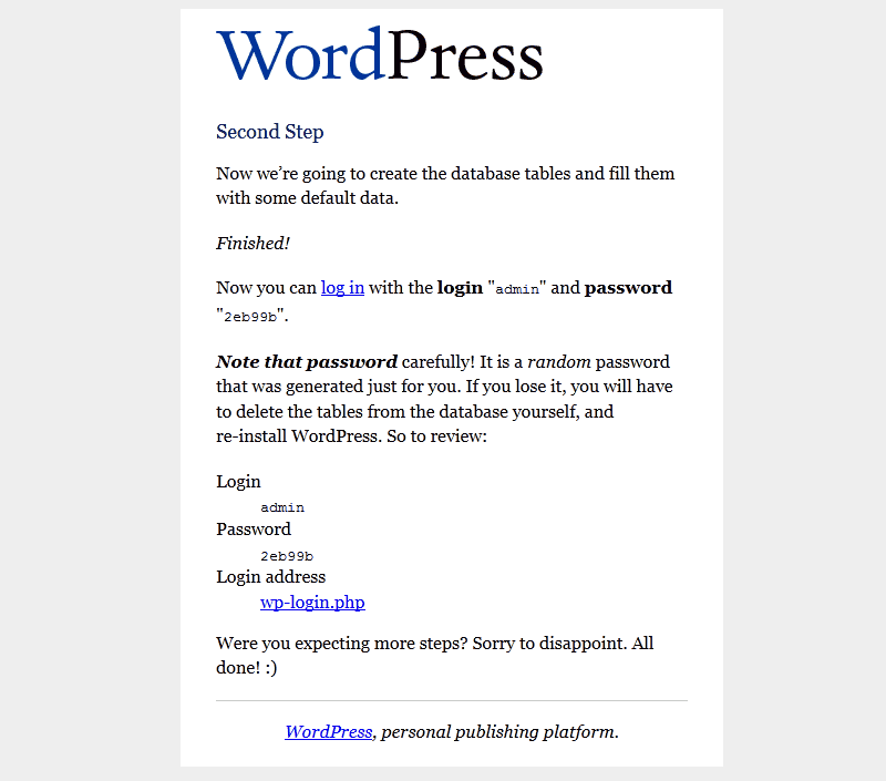
To be honest, I had an hunch that WordPress was a winner before I even finished installing it.

WordPress 1.2 Installation: Step 1
“Did you defeat the boss monster at the end?”
Something tells me they tried to use Drupal as well…

WordPress 1.2 Installation: Step 2
“Comments are groovy…”
I sure hope so.

WordPress 1.2 Installation: Step 3
“Were you expecting more steps? Sorry to disappoint. All done!”
Yes, yes I was. But I won’t hold that against you.
WordPress met all of my requirements, but also delivered something that I never expected– I was having fun.
Follow the Path
WordPress was different. WordPress had a very specific philosophy about how publishing should be done– a tao of WordPress if you like. WordPress cut through all the cruft to make publishing content simple.
While simplicity or limitation may not sit well with everyone, after trudging neck-deep through the bog of other publishing platforms, the tao of WordPress resonated strongly with me.
I wasn’t just a WordPress user, I was a fan.
Growing Pains
Time passed and WordPress did not rest on its laurels, continuing to grow and mature with each update.
The Dashboard
WordPress 1.5 introduced the Dashboard, which shifted the Write menu to second chair.

WordPress 1.5 Dashboard
The Dashboard was a valuable addition, providing an overview of your blog. At the same time though, it now required an extra click to get to the meat of WordPress– to write something.
Streamlined Installation
The installation process was also streamlined in WordPress 1.5 from the previous 3 steps down to only 2 steps. Any mention of boss monsters or groovy comments were also axed in the updated installation process.

WordPress 1.5 Installation: Step 1
WordPress 1.5 Installation: Step 2
Back to Basics?
The design of WordPress 2.5 was a major shift, though in some ways it was also a return to its roots. While the Dashboard remained the first page upon login, the Write menu once again held the first spot in the main navigation as the dashboard link was shifted to a less prominent location.

WordPress 2.5 Dashboard
Sadly, this change would only last through the next update (version 2.6).
Paradigm Shift
By 2008, WordPress was growing faster than ever and users were demanding more and more functionality from their favorite blogging platform.
In response, WordPress version 2.7 turned the WordPress world on its side– literally.
To better organize the administration menus and provide room for future expansion, WordPress’ characteristic horizontal menu was eschewed for a more practical vertical menu.

WordPress 2.7 vertical admin menu
No one could argue that the vertical menu wasn’t more sensible, but you couldn’t help but miss the simplicity of having only 4 very specific menu options that essentially spelled out how you should be using WordPress.
WordPress 2.5 main menu
In lieu of a mixture of menus of varying prominence sprinkled through the administration UI, WordPress 2.7 had a single menu, where all menu options had virtually the same prominence.
The tao of WordPress had become a choose-your-own-adventure game.
The new menu also signaled the ushering out of the stalwart Write menu, replaced with a less commanding Posts menu.

WordPress 2.5 write menu vs WordPress 2.7 posts menu
The Write menu is why I became a fan of WordPress in the first place. It would be missed, but it didn’t bother me too much– I already knew how to use WordPress. Nonetheless, I couldn’t help but recall my exasperating experience with Drupal’s nested menus and wondered whether new WordPress users were stymied by the lack of direction now offered by the administration menus.
Iconic
There was a silver lining to WordPress 2.7 however. Ben Dunkle designed a set of icons for the administration sections, something WordPress never had in the past.
WordPress 2.7 admin icons
WordPress’ path may have changed, providing choice where it once gave direction. Installation was as businesslike as ever, unlikely to ask you about boss monsters ever again. But Ben’s icons were fresh and unique– WordPress had a voice again, and I knew things would be fine.
And it was, for a time.
A Shadow Falls
Over four years had passed in relative peace since WordPress 2.7 was unleashed. By this time, the vertical administration menu had been refined into a well-oiled machine of extensibility, and new capabilities like custom post types made developers and users alike giddy with thoughts of new ways to use WordPress.
However, deep in WordPress’ Trac, where mere mortals dared not venture, there were rumblings of a change coming to WordPress’ interface. As before, Ben had come bearing a new set of icons for WordPress’ administration menus, citing issues with scalability and maintainability of the existing icons.
New Icons
But something was wrong.
Whereas the current icons were carefree and full of personality, the new icons were dark and faceless.
A shadow had fallen on WordPress.
Current icons vs new icons
Though the current icons were not without flaws of their own, the new icons sent to replace them were decidedly more generic, more befitting of a white label CMS than WordPress, the darling of the blogosphere.
Perhaps it was because the new icons aligned with the current trend towards flatter UI design, or perhaps it was because WordPress’ core developers simply felt like a change, but I was surprised to find that the new icons along with some other changes were being considered for WordPress’ next update. King Matt even heralded the changes as “The Great Flattening”.
The End?
Is this the final blow for WordPress’ unique personality? The world of web-design has “gone flat” in reaction to gradient-fatigue from the Web 2.0 era and it was only a matter of time before this design trend washed up on WordPress’ shores. Is WordPress destined to become a vanilla-flavored CMS that accommodates everyone? If it helps more users publish content, is this something we should even object to?
Hope for the Future
There is hope however. Though we may not be able to (or even want to) defend against a change to a flatter, less rounded WordPress, that doesn’t mean WordPress has to lose its identity. In fact, it is the perfect opportunity to give WordPress and even stronger identity. Instead of boilerplate icons that urge WordPress down the dark path of a white-label CMS, WordPress could have icons that make it instantly recognizable.
If you don’t want to see WordPress lose even more of its individuality, I urge you to make your voice heard now. In the absence of feedback, WordPress’ developers can only go with what they have. Let them know that there are other options.
My plea to WordPress’ core developers: Hold off on adding new icons for this cycle. Creating unique icons that speak takes time and thought. Allow others to provide feedback and suggest alternative icons instead of rushing these icons into the next update.
WordPress still has a personality, we just have to let it shine through.
Update
February 28, 2013: WordPress’ core developers have decided to hold off on “The Great Flattening”!